On March 7, 2025, the Manila International Airport Authority (MIAA) unveiled a new logo, sparking major backlash on social media.
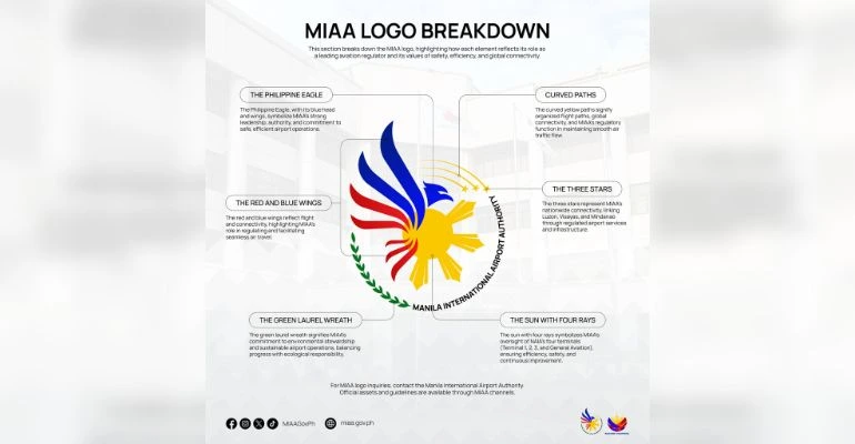
The design features a Philippine Eagle with red and blue wings, encircled by a green laurel wreath, accompanied by three stars and four sun rays.
According to MIAA, the eagle symbolizes strong leadership and commitment to safe, efficient airport operations.
The red and blue wings represent flight and connectivity, while the laurel wreath signifies environmental sustainability.
The three stars denote the interconnectivity of the Philippines’ major islands, and the four sun rays correspond to the four terminals of Ninoy Aquino International Airport (NAIA).
With this new logo they have faced major backlash on social media.
Upon its release on MIAA’s official Facebook page, the post received over 4,400 laughing reactions—far exceeding the 632 likes.
The overwhelming criticism led the agency to disable the comments section.
Many netizens compared the Manila International Airport Authority logo to a “school project” and expressed a preference for the previous design.
Adding to the controversy, freelance multimedia artist Christian San Jose, the first-place winner of MIAA’s 2023 logo-making contest, expressed disappointment.
He was surprised to see a different symbol unveiled instead of his winning design.
His original logo featured a stylized airplane with four planes in red, blue, and yellow, with negative spaces forming “MIAA.”
San Jose questioned the decision-making process behind the selection of the final Manila International Airport Authority logo.
The backlash highlights the challenges organizations face when rebranding, especially when public perception differs from intended symbolism.
As MIAA transitions from operator to regulator of NAIA, clear communication with stakeholders and public engagement will be crucial to ensuring successful branding initiatives.
According to MIAA, the eagle represents strong leadership and commitment to safe airport operations, the red and blue wings symbolize flight and connectivity, the laurel wreath signifies environmental sustainability, the three stars represent the Philippines’ major islands, and the four sun rays correspond to NAIA’s four terminals.
Many netizens criticized the MIAA logo for its design, comparing it to a “school project” and expressing a preference for the previous version.
Freelance multimedia artist Christian San Jose, who won MIAA’s 2023 logo-making contest, expressed disappointment after discovering that the agency unveiled a different logo instead of his winning design, which featured a stylized airplane and the letters “MIAA” in negative space.
Keep Reading: ‘Englishera Girl’ Speaks Out on Viral Dating Show Clip: ‘I Stand by What I Said’
Leave a Reply